
Table of content
- 1 - Learn how to use a screen reader
- 2 - Gain good knowledge of ARIA
- 3 - Use semantic HTML
- Basic concepts
- Accessibility in base components
- Other improvements
- Last words
This third part of the series aims to provide you with essential principles (not all of them, as that's almost impossible!), practical advice, and examples for creating accessible websites.
I'll share some essential guidelines that our team has followed to make our website accessible and achieve a double A level of accessibility.
We'll uncover the secrets of creating clear descriptions for images, explore the world of navigating using only the keyboard, and much more, so that everyone can browse your site like a pro. :)

1 - Learn how to use a screen reader
Before getting into the code, it's important to understand how to use a screen reader. It's a fundamental skill that will help you to know the challenges users face when navigating your website.
In our team, most of us use Voiceover as we work under MacOs. But there are alternatives for Windows systems like Speechify, JAWS and NVDA.
Taking the time to familiarize yourself with a screen reader will provide you with valuable insights into the user experience.
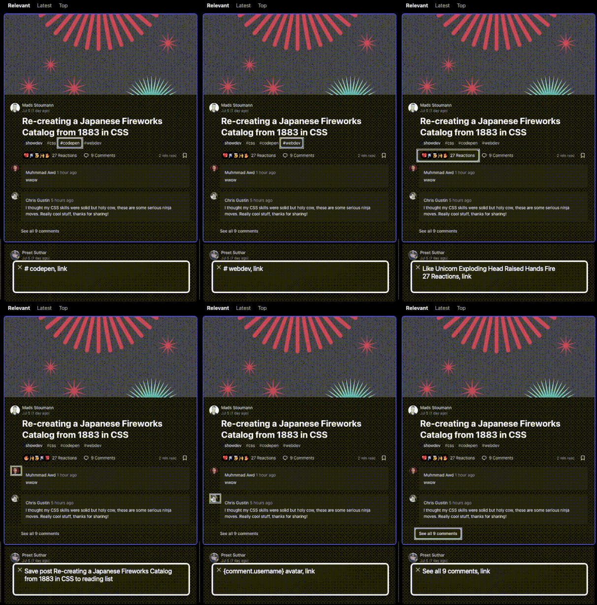
Most commonly used keys
- Tab and Shift+Tab: these keys allow users to move forward and backward through interactive elements on a web page, such as links, form fields, and buttons.
- Arrow Keys: the arrow keys are used to navigate within a block of text or move between different components, such as headings, paragraphs, and lists. Users can move up, down, left, or right to explore the content in detail.
- Nodes: navigating by nodes allows you to explore and
interact with every element, like moving from one piece of the puzzle to
another. In Voiceover you can navigate by pressing
Control + Option + Arrow key.
- Enter or Spacebar: these keys are used to activate buttons, links, or form controls. When a user lands on an interactive element, they can press Enter or Spacebar to trigger the associated action or follow a link.
- Headings: many screen readers provide shortcut keys to jump between headings. For example, pressing the "H" key allows users to navigate to the next heading, making it easier to skim through the structure of a web page.
- Search: screen readers often provide a search function that
enables users to find specific words or phrases on a webpage. By entering
keywords, users can quickly locate relevant information without having to
navigate the entire page. Also there is a
very useful combination in Voiceover to display all
headings, links and form controls, which is
Control + Shift + U.

2 - Gain good knowledge of ARIA
In this second tip, I thinks it's important to give context about what ARIA means. Basically, ARIA stands for Accessible Rich Internet Applications. It's a term that refers to a set of guidelines and tools designed to enhance the user-friendliness of websites for individuals with disabilities.
ARIA assists in providing additional information to web elements, such as buttons or links, so that screen readers and other assistive technologies can better understand them. It's like giving a shout-out to those who can't see or use a mouse, so they can navigate and interact with websites smoothly.
Most common ARIA attributes
These are the ARIA attributes that we primarily use in our journey to achieve double A accessibility for the website we were working on. There are more attributes available, but it's crucial to be familiar with at least these:
- aria-hidden: by setting
aria-hidden="true", we indicate to assistive technologies that the icon should be hidden from the accessibility tree. It's used for non-interactive elements.
<button class="icon-button">
  <span class="visually-hidden" aria-hidden="true">Close</span>
  <i class="fas fa-times"></i>
</button>
- aria-label: provides a text alternative for an element when no visible label is present.
<button class="icon-button" aria-label="Search">
  <i class="fas fa-search"></i>
</button>
- aria-labelledby: associates an element with another element that serves as its label.
<div id="alert-message" role="alert" aria-labelledby="alert-heading alert-description">
  <h3 id="alert-heading">Important Info!</h3>
  <p id="alert-description">Please be aware of the upcoming changes.</p>
</div>
The value of the attribute,
"alert-heading alert-description," corresponds to the
IDs of the heading (<h3>) and paragraph
(<p>) elements that provide the label and description for
the alert message.
By using aria-labelledby, you establish a relationship between
the <div> element and the labeled heading and description.
The screen reader will read the entire text inside those elements.
- aria-describedby: associates an element with another element that describes its purpose.
<label for="username">Username:</label>
<input type="text" id="username" aria-describedby="username-description">
<p id="username-description">Please enter a unique username consisting of letters and numbers.</p>
One common situation is to provide extra information in inputs like usernames, emails, and passwords, where the user has to use a specific set of characters.
- aria-expanded: indicates whether a collapsible element is currently expanded or collapsed.
<button id="toggle-button" aria-expanded="false" onclick="toggleContent()">
  Toggle Content
</button>
By dynamically updating the aria-expanded attribute based on the
state of the content, the screen read can announce the current state to the
user.
- aria-disabled: indicates that an element is disabled and cannot be interacted with.
<button aria-disabled="true">Submit</button>
- aria-live: indicates that content within an element should be dynamically announced to the screen reader. We often use this to inform the user of form errors.
<div aria-live="polite" id="status-message">
  New message received: You have 1 unread notification.
</div>

- role: used to define the purpose or type of an element on a web page.
The role attribute can be applied to a wide range of HTML elements, such as
<div>, <span>,
<button>, <nav>, and more. Some common
role values include "button," "link,"
"navigation," "heading," "list,"
"form," and "banner," among others. Each role value
conveys a specific meaning and functionality to assistive technologies.
<div role="alert" aria-live="assertive">
  <p>This is an important alert message!</p>
</div>
If you need to create a component with a specific role, you can refer to the patterns website of the W3C.
3 - Use semantic HTML
Well, semantic HTML is like using special tags that provide meaning and
structure to your web content. Instead of just slapping any old tag on things,
you can use tags like <header>, <nav>,
<article>, and <footer> to show the
structure and purpose of different parts of your page.
For example, instead of using a <div> for your
website's navigation menu, you would use the <nav> tag.
This tells humans, search engines, and screen readers that the content inside
it represents the site's navigation.
<nav>
  <ul>
    <li><a href="/">Home</a></li>
    <li><a href="/about">About</a></li>
    <li><a href="/services">Services</a></li>
    <li><a href="/contact">Contact</a></li>
  </ul>
</nav>
Examples of semantic usage of HTML tags
These are important situations where you have to use the appropriate tags.
<header>: represents the introductory or top section of a page.
<header>
  <h1>Welcome to My Website</h1>
  <nav>
    <!-- Navigation menu -->
  </nav>
</header>
<main>: represents the main content of a document.
<main>
  <h2>About Me</h2>
  <p>I'm passionate about web development, ...</p>
</main>
<article>: represents a self-contained composition, such as a blog post, news article, or forum post.
<article>
  <h3>Post title</h3>
  <p>Recently, I went on an amazing trip...</p>
</article>
<section>: represents a standalone section within a document.
<section>
  <h2>Services</h2>
  <ul>
    <li>Web Design</li>
    <li>Front-end Development</li>
  </ul>
</section>
<footer>: represents the bottom section of a document or section.
<footer>
<p>© 2023 MyWebsite. All rights reserved.</p>
<nav>
<!-- Footer navigation goes here -->
</nav>
</footer>
<fieldset>: is used to group the contact information fields together.
<form>
  <fieldset>
    <legend>Contact Information</legend>

    <label for="name">Name:</label>
    <input type="text" id="name" name="name">

    <label for="email">Email:</label>
    <input type="email" id="email" name="email">

    <label for="message">Message:</label>
    <textarea id="message" name="message"></textarea>
  </fieldset>

  <button type="submit">Submit</button>
</form>
The main advantage of semantic HTML
Semantic HTML elements contribute to a logical and well-organized tab order. Keyboard-only users heavily rely on the tab key to navigate through interactive elements on a webpage.
By using appropriate semantic elements like <button>,
<a>, and form elements with proper labeling,
you ensure that keyboard users can efficiently navigate and interact with
your website.
Without Semantic HTML
<section>
  <h2>Welcome!</h2>
  <p>Some paragraph</p>

  <div class="button-container">
    <div class="button">Register</div>
  </div>

  <p>Or, if you have any questions, feel free to <span class="link"><a href="/contact">contact us</a></span>.</p>
</section>
With Semantic HTML
<section>
  <h2>Welcome!</h2>
  <p>Some paragraph</p>

  <button>Register</button>

  <p>Or, if you have any questions, feel free to <a href="/contact">contact us</a>.</p>
</section>
This consideration is crucial for individuals with motor disabilities who may not be able to use a mouse.
So go ahead, embrace Semantic HTML and enjoy the ride!

Basic concepts
4 - Use tabindex, but with caution
Tabindex is an attribute you can add to HTML elements to control their keyboard navigation order. It allows you to determine which elements receive focus when users navigate through your web page using the Tab key.
By setting tabindex values, you can customize the order and make
your site more accessible to all users, especially those who rely on keyboards
for navigation.

Best practices for tabindex
Only modify the tabindex values when necessary. Most interactive elements automatically receive focus in the default Tab order, so only intervene when it improves the overall user experience.
- Possible values: the two possible values that are recommended, are "0" and "-1".
If tabindex="0" is used to make elements focusable, the
keyboard interaction must be correct and intuitive for that element. This
means that elements that are presented as buttons, for example, must respond
to both Enter and Spacebar key presses.
By giving them a tabindex value of 0, you ensure that these elements can receive keyboard focus and be easily accessed using the Tab key. It's like opening the door for keyboard users to interact with these elements that wouldn't typically be clickable.
When you set tabindex="-1", it takes the element out of
the regular navigation flow.
However, it's important to note that you should not assign the value "-1" to elements that need to be accessible via keyboard, such as links or buttons that sighted users can easily click on with a mouse.
Generally speaking, it is recommended to avoid the use of tabindex="-1" unless you have a specific reason to do so.
Maintain a logical flow: arrange tabindex values in a logical order that reflects the visual and reading flow of your content. Users should be able to navigate through your website naturally, without encountering unexpected jumps or skipping important elements.
Skip non-interactive elements: avoid assigning tabindex to non-interactive elements like text paragraphs or images. This helps users focus on interactive elements that require action or input.
5 - Create proper outlines
Outlines are like visual hugs that surround interactive elements such as buttons, links, and form fields when you interact with them.
.focus-outline {
   outline: 2px solid blue;
   outline-offset: 2px;
}
They provide a clear visual indication, usually a border or highlight, to show you which element is currently in focus. Whether you're using a keyboard or a mouse, these outlines ensure you can easily identify and interact with the right elements on a webpage.

Best practices for outlines
Visibility: outlines should be visible and clearly distinguishable, ensuring they stand out from the surrounding content. It is important to choose colors and styles that provide sufficient contrast, and to avoid designs that may cause confusion or distract from the main content.
Avoid removing outlines: it's crucial not to remove or disable outlines unless you have replaced them with a suitable and accessible alternative. Removing outlines altogether can disorient and confuse users, especially those who rely on keyboard navigation. Unfortunately, some developers occasionally choose to remove outlines. However, it's highly recommended not to do it.
Design consistency: look for a consistent outline style across your website. This helps users develop familiarity with the visual cues, promoting a smooth and intuitive browsing experience.
If you are a designer, please read the second part of this series.
6 - Allow keyboard navigation throughout your website
Keyboard navigation is one of the most important parts of web accessibility.

First, you have to know that it is closely related to semantic HTML and native elements. When you combine these two, something amazing happens - users can effortlessly navigate through most of the website using just their keyboard, without needing any special tweaks or tricks.
So, one of the principles that we are following when creating new components and develop new features, is to always use native elements whenever possible.
I will give you an example with the dialog element. Instead of creating your own modal, you should use the native component because it implements all the necessary features like escape, trap focus, close button, etc.
<dialog open>
  <p>This is a simple dialog!</p>
  <form method="dialog">
    <button>nice! ok!</button>
  </form>
</dialog>
One last advice about this is to take the #nomouse challenge! Try navigating the web page and controlling all its features using the tab key on a keyboard; don’t touch the mouse. This simple test is typically a good indicator of accessibility. For more information, see nomouse.org.
7 - Identify the language
You need to provide context about the language that the webpage is based on and specific paragraphs or components that are in a different language.
The lang attribute
Setting the lang attribute in the HTML tag allows you to declare
the language of the web page. This helps screen readers and other assistive
technologies identify and present the content correctly.
<!DOCTYPE html>
<html lang="en">
  <head>
  </head>
  <body>
  </body>
</html>
Keep in mind that if there is a paragraph in a different language you have to specify its language like this:
<body>
  <!-- English (US) content -->
  <p lang="en-US">Explore and enjoy our diverse content.</p>

  <!-- Hindi content -->
  <p lang="hi">हमारी विविधतापूर्ण सामग्री का अन्वेषण और आनंद लें।</p>
</body>
Anyway, there are a few exceptions like quotations, proper terms, technical terms, foreign words like "Sushi" or the language selector:

8 - Ensure ARIA attributes are in the correct language
If your webpage is primarily in English, it's important to ensure that aria attributes are also in English.
However, if the user switches to a different language, the aria attributes should change accordingly. It's advisable to avoid mixing languages as much as possible to maintain consistency and clarity throughout the user experience.
9 - Texts must be resizable
To make your website more user-friendly and accessible, it's crucial to ensure that the text is resizable.
Ideally, users should be able to increase the font size by up to 200% without any content getting cut off or losing any functionality.
Generally speaking, you should use em units for
font sizes.
div.a {
  font-size: 14px; // :(
}

div.b {
  font-size: 1rem; // :)
}

div.c {
  font-size: 1.2em; // :)
}
By using scalable units like em and rem, we enable
users to control the scale of the sites, thereby, providing us with our
desired accessibility.
If you are thinking about using rem, keep in mind that scaling up
and down accurately can be a challenge for all the text elements to adjust
properly.
But for sure, try to avoid px unit on font
sizes. They simply do not scale.
10 - Use headings in the proper order
When structuring your content, it's essential to use headings in a logical hierarchy.
Start with the main heading (usually <h1>) for the page
title or main section, followed by subheadings (<h2>) for
major subsections, and so on.
This hierarchy helps users understand the content's organization and allows screen readers to navigate through the page more effectively.
<h1>Best practices for Web Accessibility!</h1>
<h2>Basic concepts</h2>
<h3>Headings</h3>
<h4>Best practices for headings</h4>
....
<h2>Advanced concepts</h2>
<h3>Creating an accessible component library</h3>
It's essential to follow a consistent heading order
without skipping levels. For example, don't jump from
<h2> to <h4> directly. Skipping levels
can confuse screen readers and make it harder for users to
understand the content's structure.
As a final tip in this section, I would like to recommend you to place important interactive elements higher up in the web page.

Accessibility in base components
11 - Make images accessible
Let's explore easy-to-implement techniques to optimize your images for web accessibility.
- Provide descriptive alt text: make sure to use concise and descriptive language to describe the content and purpose of the image.
<img src=".jpg" alt="A group of friends enjoying a picnic in the park">
- Decorative alt: in some cases, you may include decorative images that don't add any significant information to your content. For such images, it's best to provide an empty alt text or use the aria-hidden attribute to let screen readers skip over them.
<img src="dec.jpg" alt="" aria-hidden="true">
- Provide captions and image descriptions: for complex images, charts, or infographics, it's helpful to provide additional context through captions or detailed image descriptions.
<figure>
  <img src="info.jpg" alt="Data visualization of population growth">
  <figcaption>Data visualization of population growth in the last decade</figcaption>
</figure>
File formats: use widely supported formats like JPEG, PNG, or GIF for regular images. If you have complex graphics or images with transparency, consider using SVG. These formats ensure compatibility with various browsers and assistive technologies.
Implement responsive images: use the
srcsetattribute to provide multiple image sources of varying sizes.
<img srcset="small.jpg 320w,
              medium.jpg 768w,
              large.jpg 1200w"
     sizes="(max-width: 768px) 100vw,
            50vw"
     src= alt="A responsive image">

12 - Create icons for everyone
Instead of using icons solely as decorative elements,
consider implementing semantic HTML elements like
<span> or <i> and provide an appropriate
text alternative.
<span class="icon" aria-hidden="true">📞</span>
<span class="sr-only">Phone</span>
In addition, icon fonts and SVGs are highly recommended for accessibility. They allow icons to be resized without losing quality and ensure compatibility across various devices and browsers.
For complex SVGs consider using title and
desc elements along with aria-labelledby like this:
<svg
   role="img"
   aria-labelledby="svg-title svg-description"
   xmlns="http://www.w3.org/2000/svg"
   xmlns:xlink="http://www.w3.org/1999/xlink"
   x="0px"
   y="0px"
   viewBox="0 0 48 48"
   xml:space="preserve">
      <title id="svg-title">A short title to resume the purpose of the svg!</title>
      <desc id="svg-description">A description with more details.</desc>
      <path d="..."/>
</svg>
13 - Don't forget states in buttons
Buttons are fundamental elements of web design, providing interactive functionality and serving as important call-to-action components.
Apart from using the semantic html tag <button>and
providing a descriptive text like "Send Message", you should also
provide visual feedback using the :focus and
:hover states.
<button class="primary-button">Save Changes</button>
.primary-button:hover {
  background-color: #42b983;
  color: white;
}

.primary-button:focus {
  background-color: #342455;
  color: black;
}
There is also the disabled state, that will require you to
use aria-disabled if its focusable:
<button aria-disabled="true">
  Continue
</button>
If the button is fully disabled then:
<button disabled>
  Continue
</button>
For toggle buttons you should use the, aria-pressed="true/false" attribute, and for menus you can use aria-expanded="true/false".

14 - Create descriptive links
Sometimes, it can be challenging to decide between using buttons or links. Our rule for making this decision is that if the user is redirected to another page or location, it should be a link.
Even if a link appears as a big shiny button, it is crucial to use the
<a> element when coding it.
Remember, this is a design tip that we covered in the second part of this series. It's important to avoid using generic link labels like "click here" or "read more."
Note: links should not solely consist of the URL, unless it is intended for printing purposes, such as in a Word document. Additionally, if a link opens in a new window, make sure to mention that to the user.
Example: Article about Web Accessibility (opens in new tab)

15 - Ensure forms are accessible
Here, we encounter one of the most challenging aspects of web accessibility.
Forms can consist of a wide range of components, such as comboboxes, inputs with various types like numbers or dates, text areas, and many more.
Ensuring the accessibility of each form component is crucial, but discussing every component in detail would be insane. Instead, I will provide you with more general but equally important tips:
- Semantic HTML (yes, again): when structuring your forms,
use semantic HTML elements like
<form>,<fieldset>, and<legend>to provide a clear and organized structure.
<form action="#">
  <fieldset>
    <legend>Do you agree?</legend>
    <input type="checkbox" id="chbx" name="agree" value="Yes!" />
    <label for="chbx">I agree</label>
  </fieldset>
</form>
This allows the screen reader to provide context about the field the user has to fill.
- Use labels: ensure each form field has a descriptive label
associated with it. Use the
<label>element and associate it with the corresponding form field using the "for" attribute or by nesting the input element within the label.
<label for="name">Name:</label>
<input type="text" id="name" name="name">
- Clear instructions: include clear and concise instructions to
guide users through the form-filling process. Place
instructions near the related form fields, using additional text or elements
such as
<p>or<span>.
<label for="email">Email:</label>
<input type="email" id="email" name="email">
<p class="instructions">Please enter a valid email address.</p>
- Provide error validation and feedback: associate error messages with their respective form fields using ARIA attributes, and use visually distinct styles or alert boxes to notify users of errors while maintaining color contrast for readability.
Here is an example, but since this is a complex topic, I recommend you reading Sandrina's post on Accessible Form Validation. Simply amazing!
<input
  id="address"
  type="text"
  required="required"
  aria-invalid="true"
  aria-describedby="addressError addressHint"
/>
<span>
  <p id="addressError">Address cannot be empty.</p>
  <p id="addressHint">Remember to include the door and apartment.</p>
</span>
16 - Include captions for videos
This is not as common as forms, but on the other hand, it is generally easier to make them accessible.
First, you need to provide captions:
<video>
  <source src="video.mp4" type="video/mp4">
  <track src="captions.vtt" kind="captions" label="English" srclang="en" default>
</video>
And second, always make controls available for keyboard users:
<video controls tabindex="0">
  <source src="video.mp4" type="video/mp4">
</video>
Some other tips are:
Avoid using flashing or blinking content that can trigger seizures.
Avoid using auto-playing media or animations that may cause distractions.
Color plays a significant role in videos, from subtitles to graphical elements. Ensure that the color contrast between the text and background is correct.
Choose an accessible video media player
17 - Provide transcripts or audio descriptions for audio content
In this case we can provide transcripts like this:
<audio controls>
  <source src="audio.mp3" type="audio/mpeg">
</audio>
<p><a href="audio-transcript.txt">Read the audio transcript</a></p>
Verify that the audio content, transcripts, captions, and audio descriptions are correctly interpreted.
Note: Audio descriptions should provide a detailed and concise narrative of the visual elements and actions taking place in the video.

18 - Use titles and make iframes responsive
Iframes are versatile tools that enable seamless embedding of external content into your website. However, some improvements are necessary to enhance their accessibility.
Use descriptive titles
When using iframes, provide descriptive titles that convey the purpose and content of the embedded page.
<iframe src="external-page.html" title="Weather Forecast"></iframe>
Make them responsive
Ensure that iframes are responsive and adapt well to different screen sizes and resolutions.
<div class="wrapper">
  <iframe src='some url' frameborder="0" allowfullscreen></iframe>
</div>
.wrapper {
  position: relative;
  padding-bottom: 56.25%; /* 16:9 */
  padding-top: 25px;
  height: 0;
}
.wrapper iframe {
  position: absolute;
  top: 0;
  left: 0;
  width: 100%;
  height: 100%;
}
Provide a fallback option
In some cases, iframes may not be supported or accessible for certain users or devices. To ensure that all users can access the essential information, provide a fallback option.
<iframe src="external-page.html">
  <img src="fallbac.jpg" alt="Fallback Image: Content Not Available">
  <p>If you are unable to view the content, please try accessing it directly using the <a href="external-page.html">fallback link</a>.</p>
</iframe>
Other improvements
19 - Make downloads descriptive
Let me briefly touch upon this topic because occasionally we encounter tricky situations that can confuse users.
This tip is basically use a descriptive link text, provide the file extension and the file size (if possible).
<a href="document.pdf">Download the User Manual (PDF, 2.5MB)</a>
20 - Create a link to bypass blocks
Bypass blocks are essential in web accessibility. They allow users to skip repetitive or non-essential content and navigate directly to the main content of a webpage.
An example:
<a href="#main-content" class="skip-link">Skip to Main Content</a>
.skip-link {
  position: fixed;
  top: 10px;
  left: 10px;
  z-index: 9999;
  padding: 10px;
  background-color: #42b983;
  color: white;
  text-decoration: none;
}

.skip-link:not(:focus):not(:active) {
  position: absolute;
  top: -9999px;
  left: -9999px;
}

.skip-link:focus {
  top: 5px;
  left: 5px;
  background-color: #0066cc;
}
The skip link is positioned fixed and visible initially. However,
I use the :not(:focus):not(:active) selector, so it is hidden
(position: absolute; top: -9999px; left: -9999px;) for mouse
users.
It only becomes visible when it receives focus or is active, following the
styles defined in the :focus selector.
This way, the skip link will be accessible and hidden for mouse users while remaining visible and functional for keyboard users.
You can test it out for yourself on dev.to :)

Last words
So there you have it! We've covered what I believe are the top 20 must-know tips for web accessibility. Special thanks to @pablo_medina and @juanpabloamador for their feedback!
The next article in the series will be about "Common accessibility challenges our team has faced". Stay tuned!
And remember, making your website accessible is not just a good practice, it is the right thing to do.

This post may be long but I hope you have learned something new from among all. If you think this might help other people, please hit the like button so that others can read it. ❤️
If you have any thoughts or questions, feel free to leave a comment!